The Department of Cancer Prevention employs a centralized intranet website as a crucial communication hub for their internal staff. This platform serves as a pivotal channel for seamless communication, real-time updates, document retrieval, and access to essential resources.
Problem Space
In our exploration, we discovered a a number of significant challenges users face. It became evident that, unless individuals are already familiar with the intricacies of navigating the site, they encounter considerable difficulties when attempting to locate information and access vital documentation. This usability issue reflects the challenge within the organization's digital ecosystem, affecting user experience and overall efficiency.
Discovery
- User Interviews & Synthesis
- Usability Testing / Contextual Inquiring
- System Usability Scale Survey
Tools & Methods Used
- Figma Wireframing
- Affinity Mapping
- Stakeholder Review & Alignment
User Interviews
Setup Overview
We invited a group of staff members from all areas of the department, different levels of seniority and tenure to participate in a discussion. The discussion was set for 45 min and was split into 4 categories;
- Introduction & background
- Moderated screen sharing
- Task based questions
- System usability scale survey
Research Goals
We set out to uncover and better understand the following ; further clarifying the problem space
- Gain insights on how DCP employees use the myDCP Intranet.
- Find areas for improving the overall usability and content of the site.
Synthesizing our discussions
Feedback and quote from our discussions were transcribed into a digital whiteboard and grouped into commonalities.
Usabilty Challenges in myDCP Intranet
Site Familiarity - Many users reported limited interaction with myDCP, describing it as occasionally visited, primarily due to its perceived complexity. Participants expressed doubts about the platform's efficiency in delivering information, pointing to infrequent usage patterns.
First Impressions - Users often had initial reactions like "Wow, a lot of stuff here," highlighting the overwhelming nature of the site. Pain points emerged concerning information architecture and hierarchy, suggesting a need for improved organization.
Frequently Used Resources - Key resources, including Administrative, Grant, and Form/Template resources, were identified as frequently used. However, difficulties in locating these resources within the myDCP framework were commonly reported.
Existing myDCP Calendar - Participants revealed a general lack of engagement with the myDCP calendar, citing its sparse content. The calendar's limited utility was a prevalent concern among users.Nine out of ten users expressed support for a division-specific calendar, provided it remained up-to-date, included meeting links, listed all DCP events, and allowed for easy integration with their Outlook calendars.
Homepage Organization - Users emphasized the need for improved homepage organization to enhance navigation. They found the current interface to require significant effort and described it as challenging to scan quickly due to the abundance of content.
Usability Testing
We wanted to understand how users are navigating the website, pain points and other opportunities. During our discussions, we described 4 scenarios and asked participants to complete a specific.
- Imagine you are a new employee and are looking to see where you sit within the organization. Locate the NCI Shady Grove floor chart.
- You are interested in learning more about grants at NCI. Your manager mentions there’s a great session available on the Intranet. Where would you find “NCI Intro to Grants” session?
- It’s “take your child to work” day and your manager asks for you to fill out the necessary forms and send them to her. Locate the applicable document on the Intranet.
- Your manager asks you to complete the required training by the end of the week. She asks you to also check for other trainings with a nearing deadline to complete.
Key Findings
The homepage was a main focal point around training deadlines. Although most participants were able to locate the resource without issue, they had some common responses related to color.
- "I think its distracting that we have many highlights, the yellows and greens are a bit distracting."
- “The color usage is distracting.”
Participants noted that some content on the site is not up to date.
- “It looks like this is it, but it’s a 2018 expired form.”
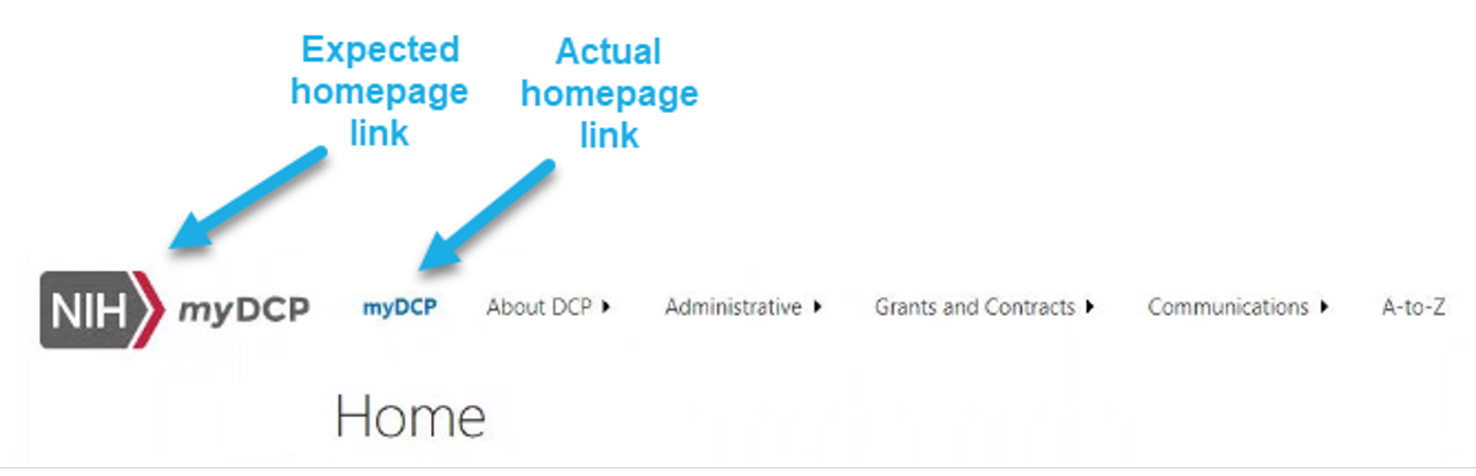
People also had some trouble getting back to the homepage, assuming the NIH/myDCP logo would take them home. Instead it redirects you to the parent page.
A portion of participants resorted to using search after only being able to locate an agenda for the defined resource. This made users question whether the training was available on myDCP or via external resource:
- “The organization of the way things are laid out is not logical.”
- “I would expect it to be under Training, but it's not there.”
Some individuals made clear that information hierarchy was a pain point among pages throughout the site
Recommended Solutions
By facilitating productive discussions and addressing concerns, we fostered a collaborative environment that allowed for valuable input and consensus-building. This alignment not only enhanced project transparency but also ensured that our recommendations and development efforts were closely aligned with stakeholder expectations.
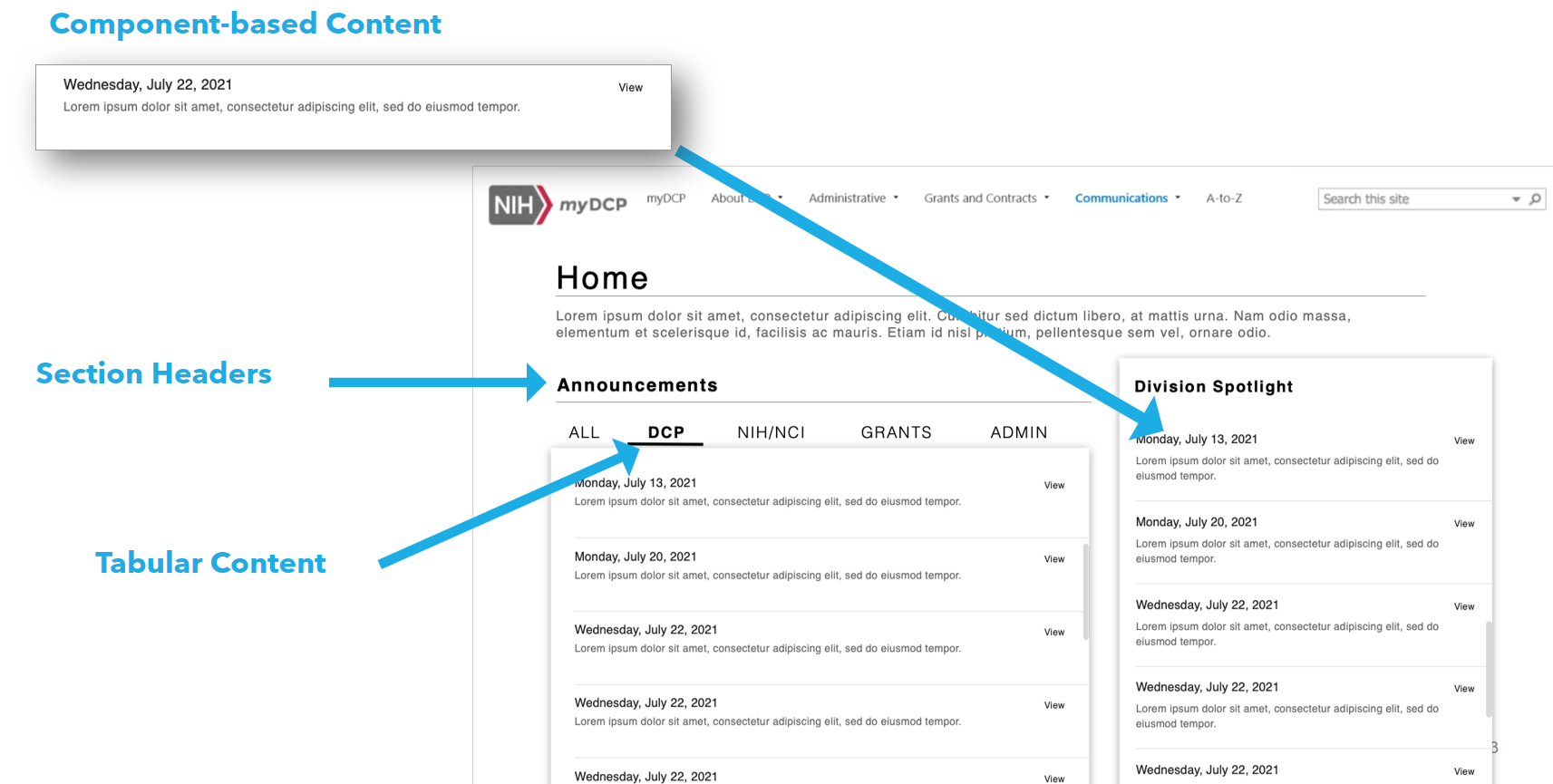
Homepage Organization
- Create a hierarchy of information – prioritizing division-specific content over organizational information.
- Add a heading label to the left navigation panel in order to provide users a clear direction around the component usage.
- The Announcements and Spotlight section should only contain the most recent news to help users focus on upcoming deadlines, communication, and events.
508 Compliance
- Create higher contrast or different color choices among page background and component background colors – this can cause individuals with visual impairments to render the site unusable.
- Consider adding weight to font sizes below 18pts – this allows individuals with impairments to create more distinction between greyscale colors.
Navigating the Site
- Redirect users to the Homepage when users click on NIH/DCP logo. Currently redirects them to a parent page – participants got lost when attempting to navigate back to the homepage.
Other Recomdenations
- Remove highlights and color usage among headline text and add component-based content headers to help users better understand each section
- Review sitewide user permissions for grants resources/proposals. Provide applicable level access to users.